一个 Plot 的生命周期
import numpy as np
import matplotlib.pyplot as plt

print(plt.style.available)
plt.style.use("fivethirtyeight")
plt.rcParams.update({
    "figure.autolayout": True,
})


# data
data = {
    'Barton LLC': 109438.50,
    'Frami, Hills and Schmidt': 103569.59,
    'Fritsch, Russel and Anderson': 112214.71,
    'Jerde-Hilpert': 112591.43,
    'Keeling LLC': 100934.30,
    'Koepp Ltd': 103660.54,
    'Kulas Inc': 137351.96,
    'Trantow-Barrows': 123381.38,
    'White-Trantow': 135841.99,
    'Will LLC': 104437.60
}
group_data = list(data.values())
group_names = list(data.keys())
group_mean = np.mean(group_data)


# plot
def currency(x, pos):
    """
    The two arguments are the value and tick position

    Args:
    x ([type]): [description]
    pos ([type]): [description]
    """
    if x >= 1e6:
        s = "${:1.1f}M".format(x * 1e-6)
    else:
        s = "${:1.0f}K".format(x * 1e-3)
    return s

fig, ax = plt.subplots(figsize = (8, 4))
# bar
ax.barh(group_names, group_data)
labels = ax.get_xticklabels()
plt.setp(labels, rotation = 45, horizontalalignment = "right")
# vertical line
ax.axvline(group_mean, ls = "--", color = "r")
# group text
for group in [3, 5, 8]:
    ax.text(
        145000,
        group,
        "New Company",
        fontsize = 10,
        verticalalignment = "center"
    )
# 标题设置
ax.title.set(y = 1.05)
# 设置X轴限制、X轴标签、Y轴标签、主标题
ax.set(
    xlim = [-10000, 140000],
    xlabel = "Total Revenue",
    ylabel = "Company",
    title = "Company Revenue"
)
# 设置X轴主刻度标签格式
ax.xaxis.set_major_formatter(currency)
# 设置X轴主刻度标签
ax.set_xticks([0, 25e3, 50e3, 75e3, 100e3, 125e3])
# 微调fig
fig.subplots_adjust(right = 0.1)
# 图片保存
print(fig.canvas.get_supported_filetypes())
fig.savefig("sale.png", transparent = False, dpi = 80, bbox_inches = "tight")
plt.show()
快速开始
def quick_start():
    import numpy as np
    import matplotlib as mpl
    import matplotlib.pyplot as plt

    X = np.linspace(0, 2 * np.pi, 100)
    Y = np.cos(X)

    fig, ax = plt.subplots()
    ax.plot(X, Y, color = "green")

    fig.savefig(
        os.path.join(
            os.path.dirname(__file__),
            "images/figure.png"
        )
    )
    fig.show()

quick_start()

一张统计图的结构

图形 API
import matplotlib.pyplot as plt

fig, ax = plt.subplots()
- 图形
- Figure:
fig - Axes:
fig.subplots - Line:
ax.plot - Markers:
ax.scatter - Grid:
ax.grid - Legend:
ax.legend - Spine:
ax.spines
- Figure:
- 标题
- Title:
ax.set_title
- Title:
- Y 轴
- y Axis:
ax.yaxis - ylabel:
ax.set_ylabel - Major tick:
ax.yaxis.set_major_locator - Major tick label:
ax.yaxis.set_major_formatter - Minor tick:
ax.yaxis.set_minor_locator
- y Axis:
- X 轴
- x Axis:
ax.xaxis - xlabel:
ax.set_xlabel - Minor tick label:
ax.xaxis.set_minor_formatter
- x Axis:
Figure
image 图像
graph 图形
aritst 可视化元素
figure 图形
canvas 画布
axes 数据在图像中的区域
data 数据
- plot
- line
- marker
Spines 边框
axis 坐标轴、坐标轴限制、坐标轴刻度、坐标轴标签、坐标轴刻度标签
grid 背景网格
legend 图例
title 标题
Figure class
- Figure
- Axes
- Artist
- canvas
fig = plt.fiure()			  # an empty figure with no Axes
fig, ax = plt.subplots()      # a figure with a single Axes
fig, ax = plt.subplots(2, 2) # a figure with a 2x2 grid of Axes
Axes class
- Figure
- Axes: a plot:data 在 image 中的区域
- title:
axes.Axes.set_title() - xlim:
axes.Axes.set_xlim() - ylim:
axes.Axes.set_ylim() - x-label:
axes.Axes.set_xlabel() - y-label:
axes.Axes.set_ylabel()
- title:
- Axes: a plot:data 在 image 中的区域
Axis class
- Figure
- Axes
- Axis
- 坐标轴(Axis)
- X axis
- Y axis
- …
- 坐标轴标签(Axis label)
- X axis label
- Y axis label
- 坐标轴限制(Axis limit)
- X axis limit
- Y axis limit
- 坐标轴刻度(Tick)
- 主刻度(Major tick)
- 副刻度(Minor tick)
- 刻度位置 Locator
- 坐标轴刻度标签(Tick label)
- 主刻度标签(Major tick label)
- 副刻度标签(Minor tick label)
- 刻度标签格式 Formatter
- 坐标轴(Axis)
- Axis
- Axes
Artist class
- 图形中可见的东西都是一个 Artist,包括 Figure、Axes、Axis、Text、Line2D、collections、Patch等对象
- 当一个 figure(图形) 被渲染时,所有的 artist 都被画在 canvas 上
- Artist
- Figure
- Axes
- Axis
- Text
- Line2D
- collections
- Pathc
- Axes
- Figure
Subplots layout
Subplots layout,子图布局
API

subplots
def subplots_layout():
    fig, ax = plt.subplots(3, 3)
    fig.show()

gridsepc
inset_axes
make_axes_locatable
Matplotlib 开发环境
Python Script
plt.show()
IPython shell
IPython Notebook
%matploblib inline
Matplotlib 编程接口
Matplotlib 的文档和示例同时使用 OO 和 pyplot 方法(它们同样强大), 可以随意使用其中任何一种(但是,最好选择其中之一并坚持使用,而不是混合使用它们)。 通常,建议将 pyplot 限制为交互式绘图(例如,在 Jupyter 笔记本中), 并且更喜欢 OO 风格的非交互式绘图(在旨在作为更大项目的一部分重用的函数和脚本中)。
下面是两个简单的示例:
- pyplot API
fig = plt.figure()
# or plt.figure()
ax = plt.axes()
plt.plot(
    [1, 2, 3, 4],
    [1, 4, 2, 3]
);
- 面向对象 API
fig = plt.figure()
ax = plt.axes()
ax.plot(
    [1, 2, 3, 4],
    [1, 4, 2, 3]
);
fig, ax = plt.subplots()
ax.plot(
    [1, 2, 3, 4],
    [1, 4, 2, 3]
);
pyplot 接口
MatLab 风格接口
pyplot 是使 Matplotlib 像 MATLAB 一样工作的函数集合。每个 pyplot 函数都会对图形进行一些更改:
例如,创建图形、在图形中创建绘图区域、在绘图区域中绘制一些线条、用标签装饰绘图等。
在 pyplot 函数调用中保留各种状态,以便跟踪当前图形(figure)和绘图区域(plotting area)等内容,并且绘图函数指向当前轴(axes)
API
- Figure 和 Axes
fig = plt.figure(num = n, figsize = ())plt.subplot(m, n ,i)orplt.subplot(mni)plt.gcf()返回当前图形,matplotlib.figure.Figure实例plt.gca()函数返回当前轴,matplotlib.axes.Axes实例
- 基本图形函数
plt.plot(x, y, color, linestyle, marker)plt.bar()plt.scatter()
- 辅助函数
- 标题
plt.suptitle()plt.title()
- 图例
plt.legend()plt.colorbar()
- 坐标轴
- 坐标轴上下限
plt.axis([xmin, xmax, ymin, ymax])plt.axis("tight")收紧坐标轴,不留空白区域plt.axis("equal")让屏幕上显示的图形分辨率为 1:1,x 轴单位长度与 y 轴单位长度相等plt.xlim()plt.ylim()
- 坐标轴标签
plt.xlabel()plt.ylabel()
- 坐标轴上下限
- 文本注释
plt.text()plt.annotate()
- 其他
plt.show()plt.grid()
- 标题
示例
# 图形
fig = plt.figure(num = 2, figsize = (8, 8))
# 坐标轴
# ax = plt.axes()

plt.subplot(211)
plt.plot(x, np.sin(x), label = "sin")
plt.xlabel("x label")
plt.ylabel("y label")
plt.title("Simple Plot")
plt.legend()

plt.subplot(212)
plt.plot(x, np.cos(x), label = "cos")
plt.xlabel("x label")
plt.ylabel("y label")
plt.title("Simple Plot")
plt.legend()
plt.show()

fig.savefig();
plt.gcf() # 获取当前图形(figure)
plt.gca() # 获取当前坐标轴(axes)
OOP 接口
API
- Figure 和 Axes
fig, ax = plt.subplots(nrows, ncols, figsize, sharex, sharey)fig, ax = plt.subplots()默认 nrow=1, ncols=1fig, ax = plt.subplots(n)默认 nrows=n, ncols=1fig, ax = plt.subplots(m, n)
- 基本图形函数
ax.plot(x, y, color, linestyle, marker)ax.bar()ax.scatter()
- 辅助函数
- 标题
ax.set_title()
- 图例
ax.legend()
- 坐标轴
- 坐标轴上下限
ax.set_xlim()ax.set_ylim()
- 坐标轴标签
ax.set_xlabel()ax.set_ylabel()
- 坐标轴上下限
- 文本注释
- 其他
ax.set(xlim, ylim, xlabel, ylabel, title)
- 标题
示例
# data
x = np.linspace(0, 2, 100)

# plot
fig, ax = plt.subplots(1, 3, figsize = (18, 5), sharey = True)
ax[0].plot(x, x, label = "linear")
ax[0].plot(x, x**2, label = "quadratic")
ax[0].plot(x, x**3, label = "cubic")
ax[0].set_xlabel("x label")
ax[0].set_ylabel("y label")
ax[0].set_title("linear Plot")
ax[0].legend()

ax[1].plot(x, x, label = "linear")
ax[1].plot(x, x**2, label = "quadratic")
ax[1].plot(x, x**3, label = "cubic")
ax[1].set_xlabel("x label")
ax[1].set_ylabel("y label")
ax[1].set_title("quadratic Plot")
ax[1].legend()

ax[2].plot(x, x, label = "linear")
ax[2].plot(x, x**2, label = "quadratic")
ax[2].plot(x, x**3, label = "cubic")
ax[2].set_xlabel("x label")
ax[2].set_ylabel("y label")
ax[2].set_title("cubic Plot")
ax[2].legend();
GUI 应用程序中嵌入 Matplotlib
- 略
最佳实践
- 用不同数据绘制同样的图片
- 方法
def my_plotter(ax, data1, data2, param_dict):
    """
    A helper function to make a graph

    Parameters
    ----------
    ax : Axes
        The axes to draw to

    data1 : array
       The x data

    data2 : array
       The y data

    param_dict : dict
       Dictionary of keyword arguments to pass to ax.plot

    Returns
    -------
    out : list
        list of artists added
    """
       out = ax.plot(data1, data2, **param_dict)
    return out
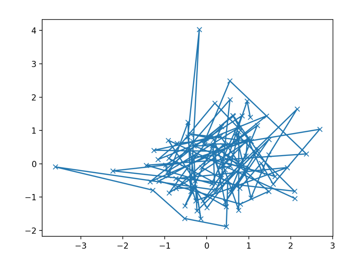
- 使用
# data
data1, data2, data3, data4 = np.random.randn(4, 100)
# plot
fig, ax = plt.subplots(1, 1)
my_plotter(ax, data1, data2, {"marker": "x"})
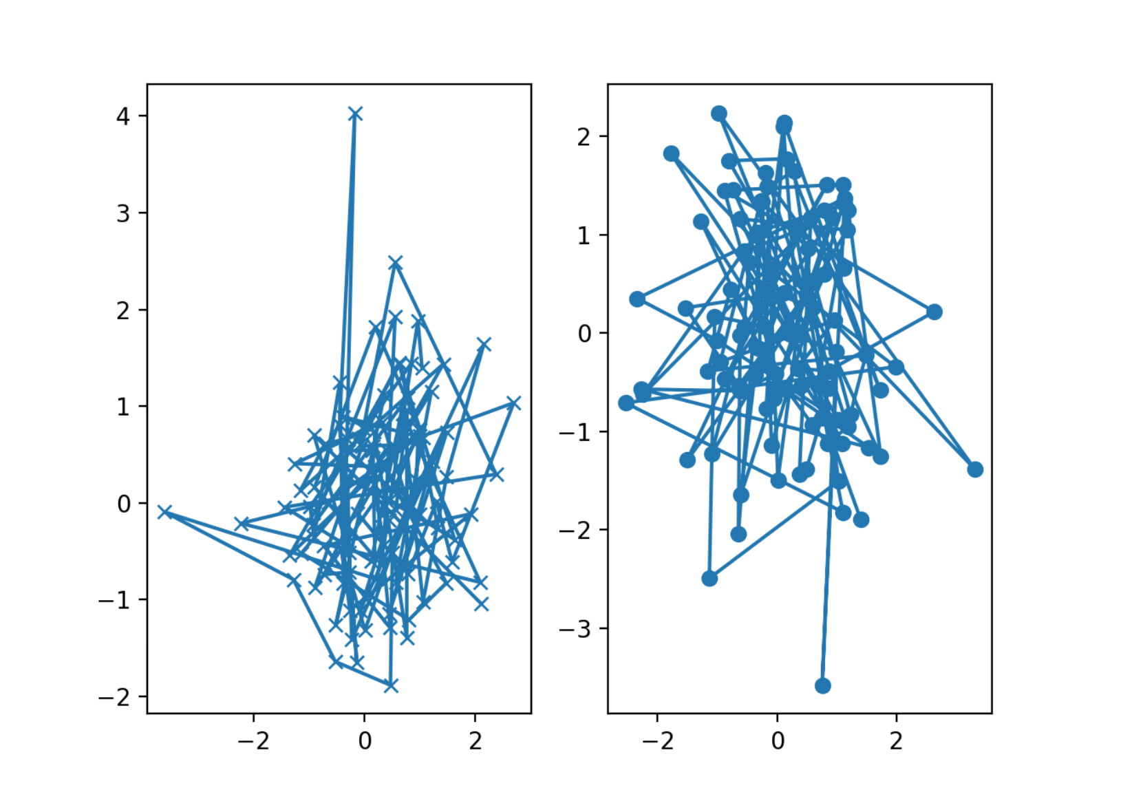
# data
data1, data2, data3, data4 = np.random.randn(4, 100)
# plot
fig, ax = plt.subplots(1, 1)
my_plotter(ax, data1, data2, {"marker": "x"})
my_plotter(ax, data3, data4, {"marker": "o"})
Matplotlib 个性化
- rcParams
- style sheets
- matplollibrc file
优先级: rcParams > style sheets > matplotlibrc file
rcParams
rc: runtime configuration
- rc 设置保存在类字典的变量中 matplotlib.rcParams
- rc 设置对于 matplotlib 库是全局的
- 可以动态改变默认 rc 设置
- rc 设置可以直接修改
API
mpl.rc()mpl.rcParamsmpl.rc_context()@mpl.rc_context()
配置选项
rc = dict(mpl.rcParams)
rc_table = pd.DataFrame({
    "param": rc.keys(),
    "value": rc.values(),
})
# rc_table
全局设置
from cycler import cycler

# lines
mpl.rcParams["lines.linewidth"] = 2
mpl.rcParams["lines.linestyle"] = "--"
mpl.rc("lines", linewidth = 4, linestyle = "--")
# axes
mpl.rcParams["axes.porp_cycle"] = cycler(color = ["r", "g", "b", "y"])
临时设置
with mpl.rc_context({"lines.linewidth": 2, "lines.linestyle": ":"}):
    plt.plot(data)

@mpl.rc_context({"lines.linewidth": 3, "lines.linestyle": "-"})
def plotting_function():
    plt.plot(data)
style sheets
matplotlib.pyplot.style
API
plt.styleplt.style.availableplt.style.use()plt.style.context()
所有样式
print(plt.style.available)
['Solarize_Light2',
 '_classic_test_patch',
 '_mpl-gallery',
 '_mpl-gallery-nogrid',
 'bmh',
 'classic',
 'dark_background',
 'fast',
 'fivethirtyeight',
 'ggplot',
 'grayscale',
 'seaborn-v0_8',
 'seaborn-v0_8-bright',
 'seaborn-v0_8-colorblind',
 'seaborn-v0_8-dark',
 'seaborn-v0_8-dark-palette',
 'seaborn-v0_8-darkgrid',
 'seaborn-v0_8-deep',
 'seaborn-v0_8-muted',
 'seaborn-v0_8-notebook',
 'seaborn-v0_8-paper',
 'seaborn-v0_8-pastel',
 'seaborn-v0_8-poster',
 'seaborn-v0_8-talk',
 'seaborn-v0_8-ticks',
 'seaborn-v0_8-white',
 'seaborn-v0_8-whitegrid',
 'tableau-colorblind10']
全局样式
plt.style.use("ggplot")
plt.style.use("./images/presentation.mplstyle")
plt.style.use(["dark_background", "presentation"])
临时样式
with plt.style.context("dark_background"):
    plt.plot(data)
matplotlibrc file
matplotlibrc 文件的位置:
- 当前目录
\$MATPLOTLIBRC或\$MATPLOTLIBRC\matplotlibrc.matplotlib/matplotlibrcINSTALL/matplotlib/mpl-data/matplotlibrc
查看当前加载的 matplotlibrc 文件的位置
mpl.matploblib_fname()
'D:\\software\\miniconda3\\envs\\pysci\\lib\\site-packages\\matplotlib\\mpl-data\\matplotlibrc'
Matplotlib 图形保存
图像文件格式
在 savefig() 里面,保存的图片文件格式就是文件的扩展名。
Matplotlib 支持许多图形格式,可以通过 canvas 对象的方法查看系统支持的文件格式
fig = plt.figure()
fig.canvas.get_supported_filetypes()
{'eps': 'Encapsulated Postscript',
 'jpg': 'Joint Photographic Experts Group',
 'jpeg': 'Joint Photographic Experts Group',
 'pdf': 'Portable Document Format',
 'pgf': 'PGF code for LaTeX',
 'png': 'Portable Network Graphics',
 'ps': 'Postscript',
 'raw': 'Raw RGBA bitmap',
 'rgba': 'Raw RGBA bitmap',
 'svg': 'Scalable Vector Graphics',
 'svgz': 'Scalable Vector Graphics',
 'tif': 'Tagged Image File Format',
 'tiff': 'Tagged Image File Format',
 'webp': 'WebP Image Format'}
保存
fig.savefig("my_figure.png")
展示
from IPython.display import Image

Image("my_figure.png")
基本图形
plot
- 线形图
- 散点图
plot([X], Y, [fmt], color, marker, linestyle)
scatter
散点图
scatter(X, Y, [s]izes, [c]olors, markers, alpha, cmap)
bar
bar[h](x, height, width, bottom, align, color)
imshow
imshow(Z, cmap, interpolation, extent, origin)
contour
contour[f]([X], [Y], Z, levels, colors, extent, origin)
pcolormesh
pcolormesh([X], [Y], Z, vmin, vmax, cmap)
quiver
quiver([X], [Y], U, V, C, units, angles)
pie
pie(Z, explode, labels, colors, raidus)
text
text(x, y, text, va, ha, size, weight, transform)
fill
fill[_between][x](X, Y1, Y2, color, where)
高级图形
step
step(X, Y, [fmt], color, marker, where)
boxplot
boxplot(X, notch, sym, bootstrap, widths)
errorbar
errorbar(X, Y, xerr, yerr, fmt)
示例:
# data
dx = 0.1
x = np.linspace(0, 10, 50)
dy = 0.8
y = np.sin(x) + dy * np.random.randn(50)

# plot
fig = plt.figure()
plt.errorbar(
    x, y,
    yerr = dy,
    xerr = dx
    fmt = ".k",
    ecolor = "lightgray",
    elinewidth = 3,
    capsize = 0
)
hist
hist(X, bins, range, density, weights)
violinplot
violinplot(D, positions, widths, vert)
barbs
barbs([X], [Y], U, V, C, length, pivot, sizes)
eventplot
eventplot(positions, orientation, lineoffsets)
hexbin
hexbin(X, Y, C, gridsize, bins)
Color, Line, Marker
Color
Sigle Color
常用单色:
| character | color |
|---|---|
'b' |
blue |
'g' |
green |
'r' |
red |
'c' |
cyan |
'm' |
magenta |
'y' |
yellow |
'k' |
black |
'w' |
white |
# data
x = np.linspace(0, 10, 1000)

# plot
fig, ax = plt.subplots()
ax.plot(x, x + 0, color='blue', label = "blue")  # 标准颜色名称
ax.plot(x, x + 1, color='g', label = "g")  # 缩写颜色代码(rgbcmyk)
ax.plot(x, x + 2, color='0.75', label = "0.75")  # 范围在0~1的灰度值
ax.plot(x, x + 3, color='#FFDD44', label = "#FFDD44")  # 十六进制(RRGGBB,00~FF)
ax.plot(x, x + 4, color=(1.0,0.2,0.3), label = "(1.0,0.2,0.3)")  # RGB元组,范围在0~1
ax.plot(x, x + 5, color='chartreuse', label = "chartreuse")  # HTML颜色名称
ax.legend(loc = "best");

Colormaps
plt.get_cmap(name)- Uniform
viridismagmaplasma
- Sequential
GreysYlOrBrWistia
- Diverging
SpectralcoolwarmRdGy
- Quanlitative
tab10tab20
- Cyclic
twilight
- Uniform

Line
linestyle 或者 ls:
| character | description | |
|---|---|---|
'-' |
solid line style | 实线 |
'--' |
dashed line style | 实点线 |
'-.' |
dash-dot line style | 虚线 |
':' |
dotted line style | 点划线 |
# data
x = np.linspace(0, 10, 1000)

# plot
fig, ax = plt.figure(), plt.axes()
plt.plot(x, x + 0, linestyle='solid', label = "solid")
plt.plot(x, x + 1, linestyle='dashed', label = "dashed")
plt.plot(x, x + 2, linestyle='dashdot', label = "dashdot")
plt.plot(x, x + 3, linestyle='dotted', label = "dotted")
plt.plot(x, x + 4, linestyle='-', label = "-") # 实线
plt.plot(x, x + 5, linestyle='--', label = "--") # 虚线
plt.plot(x, x + 6, linestyle='-.', label = "-.") # 点划线
plt.plot(x, x + 7, linestyle=':', label = ":") # 实点线
plt.legend(loc = "best");

Marker
marker:
| character | description |
|---|---|
'.' |
point marker |
',' |
pixel marker |
'o' |
circle marker |
'v' |
triangle_down marker |
'^' |
triangle_up marker |
'<' |
triangle_left marker |
'>' |
triangle_right marker |
'1' |
tri_down marker |
'2' |
tri_up marker |
'3' |
tri_left marker |
'4' |
tri_right marker |
'8' |
octagon marker |
's' |
square marker |
'p' |
pentagon marker |
'P' |
plus (filled) marker |
'*' |
star marker |
'h' |
hexagon1 marker |
'H' |
hexagon2 marker |
'+' |
plus marker |
'x' |
x marker |
'X' |
x (filled) marker |
'D' |
diamond marker |
'd' |
thin_diamond marker |
'|' |
vline marker |
'_' |
hline marker |
示例:
fig, ax = plt.subplots(figsize = (12, 12))
rng = np.random.RandomState(0)
for marker in [".", ",", "o", "v", "^", "<", ">",
               "1", "2", "3", "4", "8", "s", "p", "P",
               "*", "h", "H", "x", "X", "+", "d", "D",
               "|", "_"]:
    plt.plot(rng.rand(5), rng.rand(5), marker, label = f"marker={marker}")
    plt.legend(numpoints = 1)
    plt.xlim(0, 1.8)
marker 参数:
# data
x = np.linspace(0, 10, 30)
y = np.sin(x)

# plot
fig, ax = plt.subplots(figsize = (5, 5))
plt.plot(
    x, y, "-p", color = "gray", linewidth = 4,
    markersize = 15,
    markerfacecolor = "white",
    markeredgecolor = "gray",
    markeredgewidth = 2,
)
Color 加 Line 和 Marker
使用示例:
'b'# blue markers with default shape'or'# red circles'-g'# green solid line'--'# dashed line with default color'^k:'# black triangle_up markers connected by a dotted line
# data
x = np.linspace(0, 10, 1000)

# plot
fig, ax = plt.figure(), plt.axes()
plt.plot(x, x + 0, '-g') # 绿色实线
plt.plot(x, x + 1, '--c') # 青色虚线
plt.plot(x, x + 2, '-.k') # 黑色点划线
plt.plot(x, x + 3, ':r'); # 红色实点线
plt.plot(x, x + 4, 'or');
plt.plot(x, x + 5, '^k');
plt.legend(loc = "best");
Scales
ax.set_[xy]scale(scale, ...)
- linear
- log
- symlog
- logit
Projections
subplot(..., projection = p)
- p = “polar”
- p = “3d”
- p = Orthographic()
from cartopy.crs import Cartographic
Tick locators
from matplotlib import ticker

ax.[xy]axis.set_[minor|major]_locator(locator)
locator:
- ticker.NullLocator()
- ticker.MultipleLocator(0.5)
- ticker.LinearLocator(numticks = 3)
- ticker.IndexLocator(base = 0.5, offset = 0.25)
- ticker.AutoLocator()
- ticker.MaxNLocator(n = 4)
- ticker.LogLocator(base = 10, numticks = 15)
Tick formatters
from matplotlib import ticker

ax.[xy]axis.set_[minor|major]_formatter(formatter)
formatter:
- ticker.NullFormatter()
- ticker.FixedFormatter([“zeor”, “one”, “two”, …])
- ticker.FuncFormatter(lambda x, pos: “[%.2f]” % x)
- ticker.FormatStrFormatter(">%d<")
- ticker.ScalarFormatter()
- ticker.StrMethodFormatter("{x}")
- ticker.PercentFormatter(xmax = 5)
Ornaments
ax.legend(...)- ax.colorbar()
- ax.annotate()
Event handling
import matplotlib.pyplot as plt

fig, ax = plt.subplots()

def on_click(event):
    print(event)

fig.canvas.mpl_connect("button_press_event", on_click)
Animation
import matplotlib.animation as mpla

T = np.linspace(0, 2 * np.pi, 100)
S = np.sin(T)
line, = plt.plot(T, S)

def animate(i):
    line.set_ydata(np.sin(T + i / 50))

anim = mpla.FuncAnimation(plt.gcf(), animate, interval = 5)
plt.show()
Quick reminder
import matplotlib.pyplot as plt

fig, ax = plt.subplots()

ax.grid()
ax.set_[xy]lim(vmin, vmax)
ax.set_[xy]label(label)
ax.set_[xy]ticks(ticks, [labels])
ax.set_[xy]ticklabels(labels)
ax.set_title(title)
ax.tick_params(width = 10, ...)
ax.set_axis_[on|off]()

fig.suptitle(title)

fig.tight_layout()

plt.gcf(), plt.gca()

mpl.rc("axes", linewidth = 1, ...)

[fig|ax].patch.set_alpha(0)

text = r"$frac{-e^{i\pi}}{2^n}"
函数输入格式
- numpy.array
- pandas data object => np.array
- numpy.matrix => np.array
# pandas.DataFrame 转换
pandas_dataframe = pandas.DataFrame()
array_inputs = pandas_datarframe.values

# numpy.matrix 转换
numpy_matrix = numpy.matrix([1, 2], [3, 4])
array_inputs = numpy.asarray(numpy_matrix)
- numpy.ma.masked_array
Image
- Matplotlib 依赖 Pillow 库导入图片数据
import matplotlib.image as mpimg
将 image 数据转换为 Numpy array
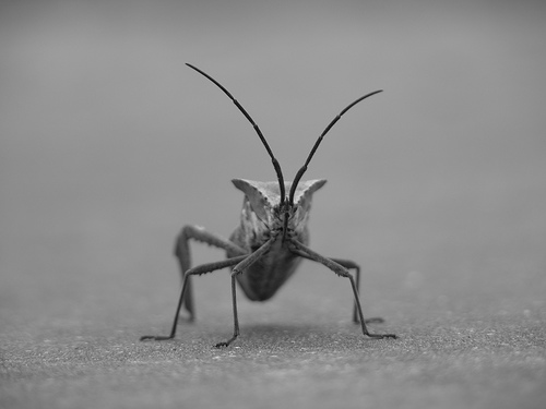
- 图片信息
- 24-bit RGB PNG image(8 big for each R, G, B)
- 其他格式图片
- RGBA(允许透明度 transparency)图片
- 单通道灰度(single-channel grayscale, luminosity)图片
- 图片 array 数据
- dtype: float32
- matplotlib 将每个通道的 8 位数据重新缩放为 0.0 和 1.0 之间的浮点数据
- Pillow 可以使用的唯一数据类型是 uint8
- matplotlib 绘图可以处理 float32 和 uint8,但对 PNG 以外的任何格式的图像读取、写入仅限于 uint8,大多数显示器只能呈现每个通道 8 位的颜色等级,因为人眼所能看到的只有 8 位
img = mpimg.imread("stinkbug.png")
print(img)
print(img.shape)

[[[0.40784314 0.40784314 0.40784314]
  [0.40784314 0.40784314 0.40784314]
  [0.40784314 0.40784314 0.40784314]
  ...
  [0.42745098 0.42745098 0.42745098]
  [0.42745098 0.42745098 0.42745098]
  [0.42745098 0.42745098 0.42745098]]

 [[0.4117647  0.4117647  0.4117647 ]
  [0.4117647  0.4117647  0.4117647 ]
  [0.4117647  0.4117647  0.4117647 ]
  ...
  [0.42745098 0.42745098 0.42745098]
  [0.42745098 0.42745098 0.42745098]
  [0.42745098 0.42745098 0.42745098]]

 [[0.41960785 0.41960785 0.41960785]
  [0.41568628 0.41568628 0.41568628]
  [0.41568628 0.41568628 0.41568628]
  ...
  [0.43137255 0.43137255 0.43137255]
  [0.43137255 0.43137255 0.43137255]
  [0.43137255 0.43137255 0.43137255]]

 ...

 [[0.4392157  0.4392157  0.4392157 ]
  [0.43529412 0.43529412 0.43529412]
  [0.43137255 0.43137255 0.43137255]
  ...
  [0.45490196 0.45490196 0.45490196]
  [0.4509804  0.4509804  0.4509804 ]
  [0.4509804  0.4509804  0.4509804 ]]

 [[0.44313726 0.44313726 0.44313726]
  [0.44313726 0.44313726 0.44313726]
  [0.4392157  0.4392157  0.4392157 ]
  ...
  [0.4509804  0.4509804  0.4509804 ]
  [0.44705883 0.44705883 0.44705883]
  [0.44705883 0.44705883 0.44705883]]

 [[0.44313726 0.44313726 0.44313726]
  [0.4509804  0.4509804  0.4509804 ]
  [0.4509804  0.4509804  0.4509804 ]
  ...
  [0.44705883 0.44705883 0.44705883]
  [0.44705883 0.44705883 0.44705883]
  [0.44313726 0.44313726 0.44313726]]]

(375, 500, 3)
将 Numpy array 绘制成图片
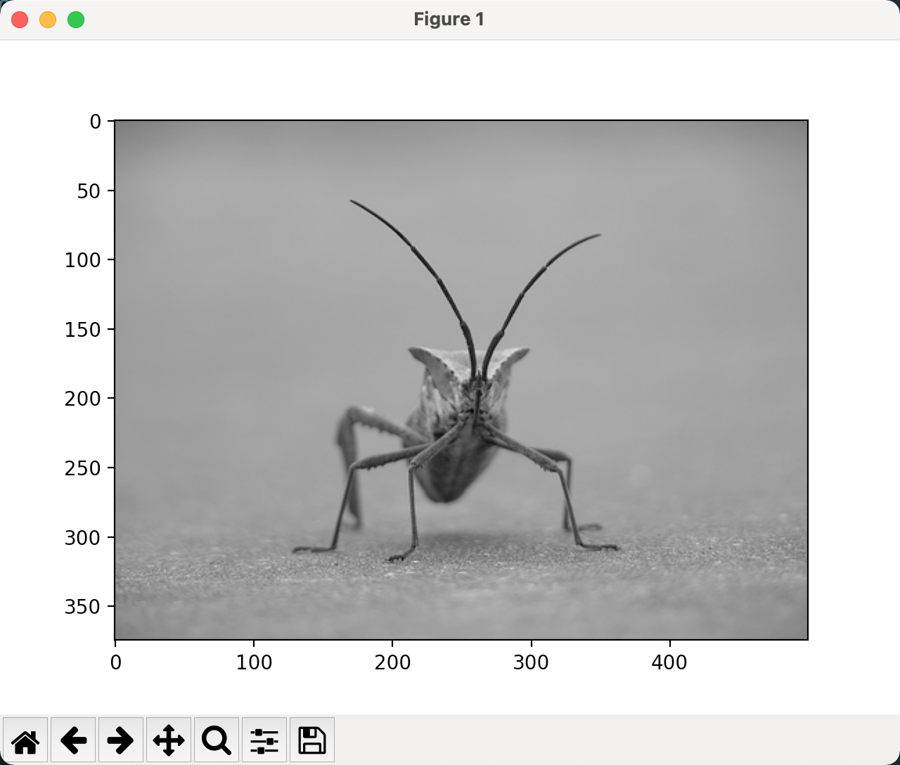
imgplot = plt.imshow(img)
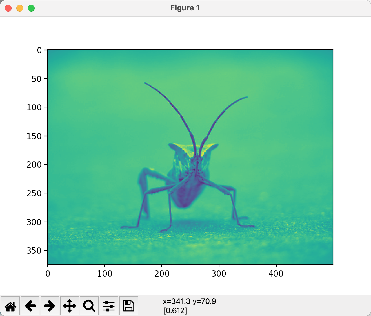
将伪彩色方案应用于图像
- 伪彩色可以使图像增强对比度和更轻松地可视化数据
- 伪彩色仅与单通道、灰度、亮度图像有关
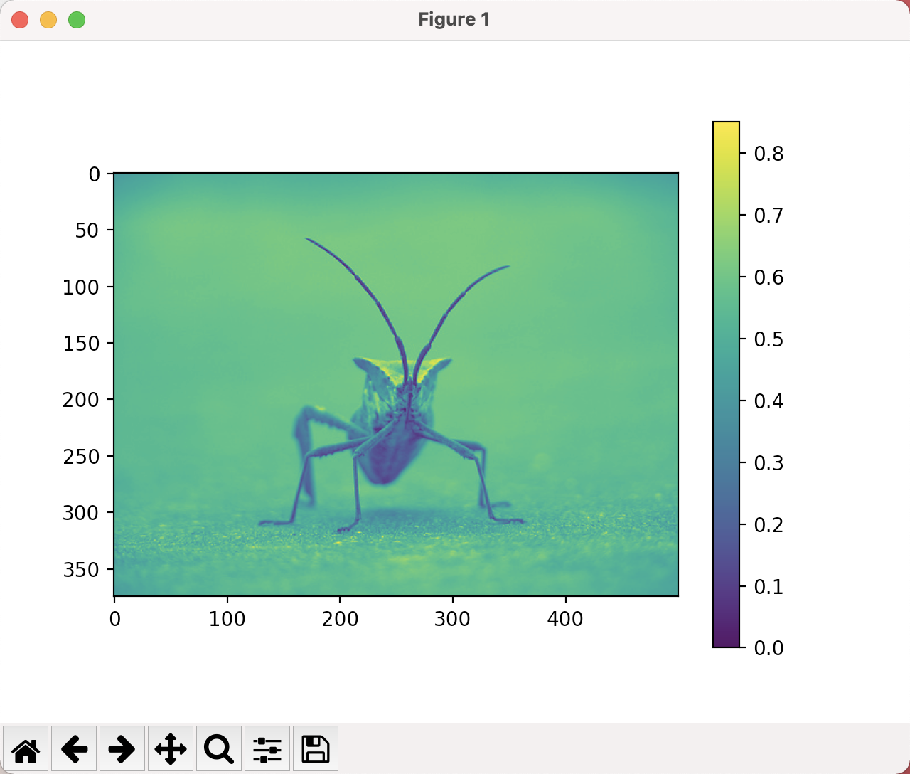
lum_img = img[:, :, 0]
plt.imshow(lum_img)
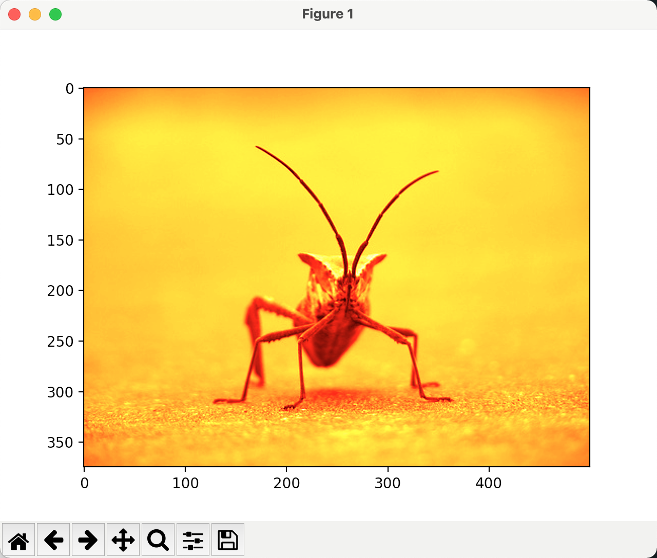
lum_img = img[:, : 0]
plt.imshow(lum_img, cmap = "hot")
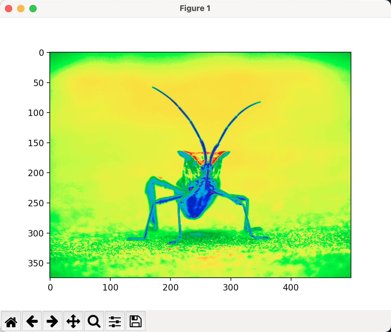
lum_img = img[:, :, 0]
imgplot = plt.imshow(lum_img)
imgplot.set_cmap("nipy_spectral")
色标参考
lum_img = img[:, : 0]
imgplot = plt.imshow(lum_img)
plt.colorbar()
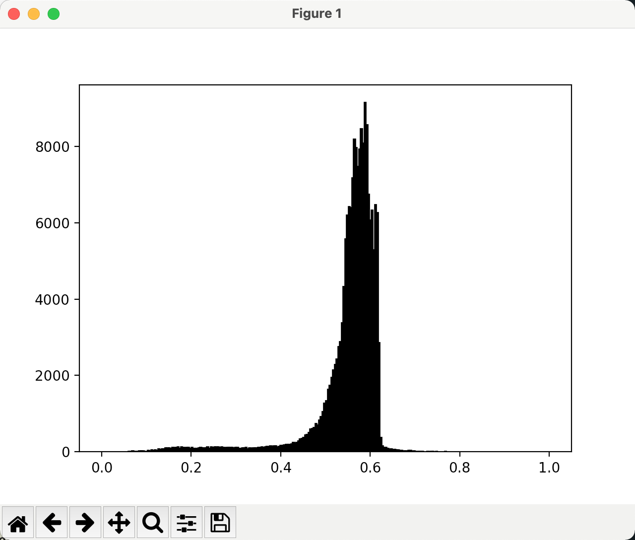
检查特定数据范围
lum_img = img[:, :, 0]
plt.hist(lum_img.ravel(), bins = 256, range(0.0, 1.0), fc = "k", ec = "k")
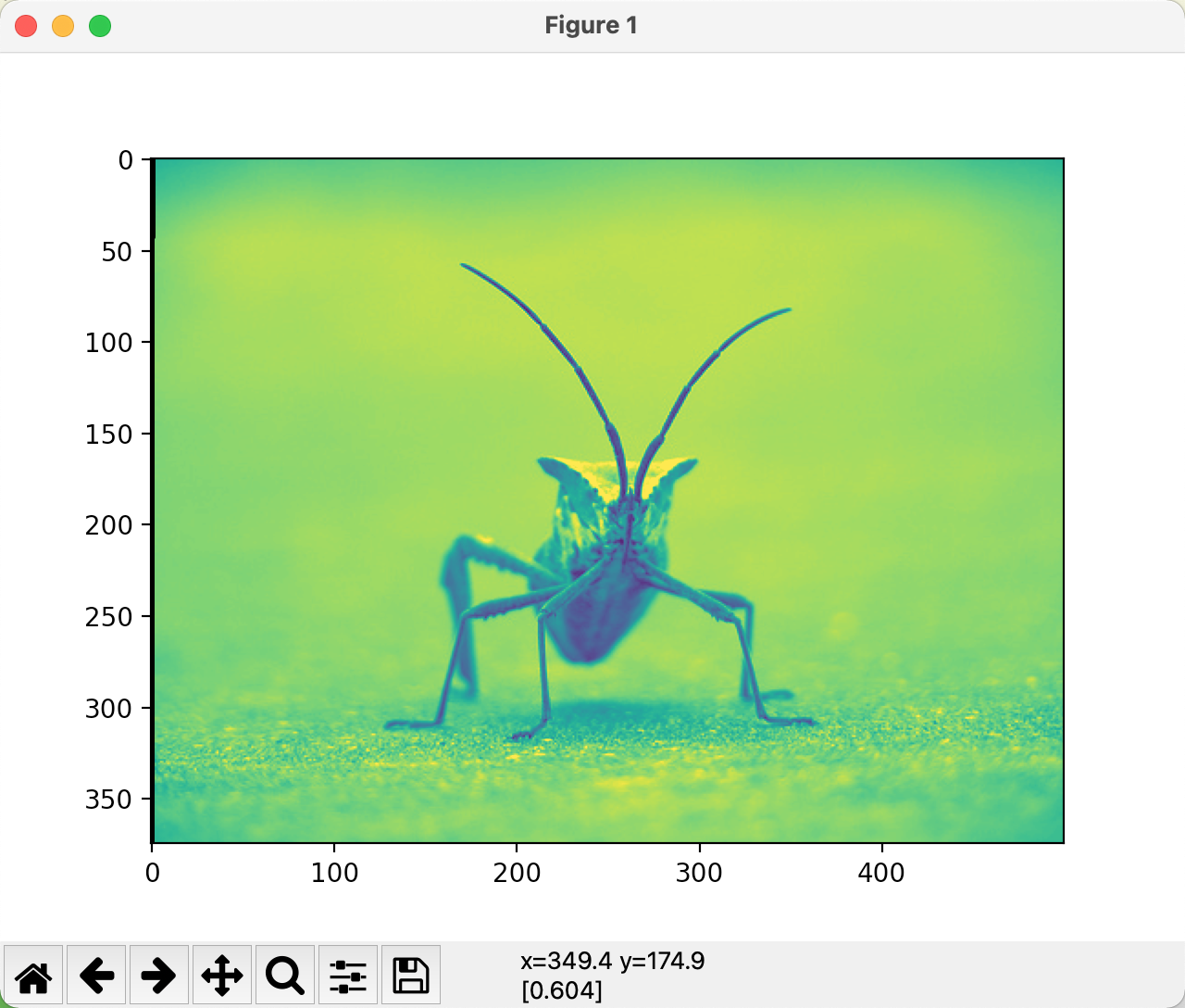
# 调增上限,有效放大直方图中的一部分
lum_img = img[:, :, 0]
imgplot = plt.imshow(lum_img, clim = (0.0, 0.7))
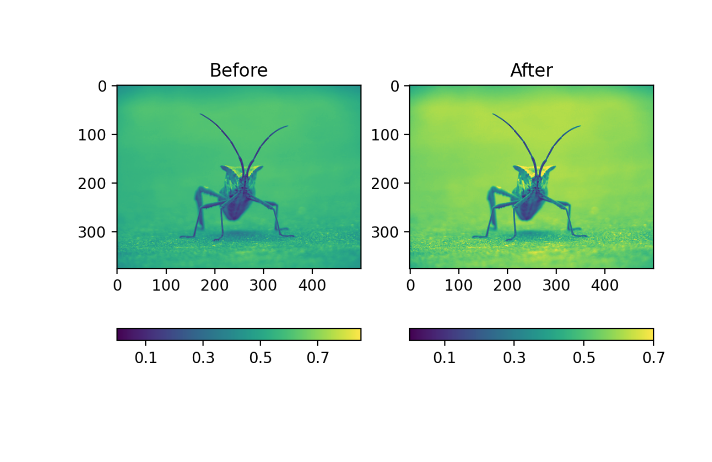
lum_img = img[:, :, 0]

fig = plt.figure()

ax = fig.add_subplot(1, 2, 1)
imgplot = plt.imshow(lum_img)
ax.set_title('Before')
plt.colorbar(ticks=[0.1, 0.3, 0.5, 0.7], orientation='horizontal')

ax = fig.add_subplot(1, 2, 2)
imgplot = plt.imshow(lum_img)
imgplot.set_clim(0.0, 0.7)
ax.set_title('After')
plt.colorbar(ticks=[0.1, 0.3, 0.5, 0.7], orientation='horizontal')
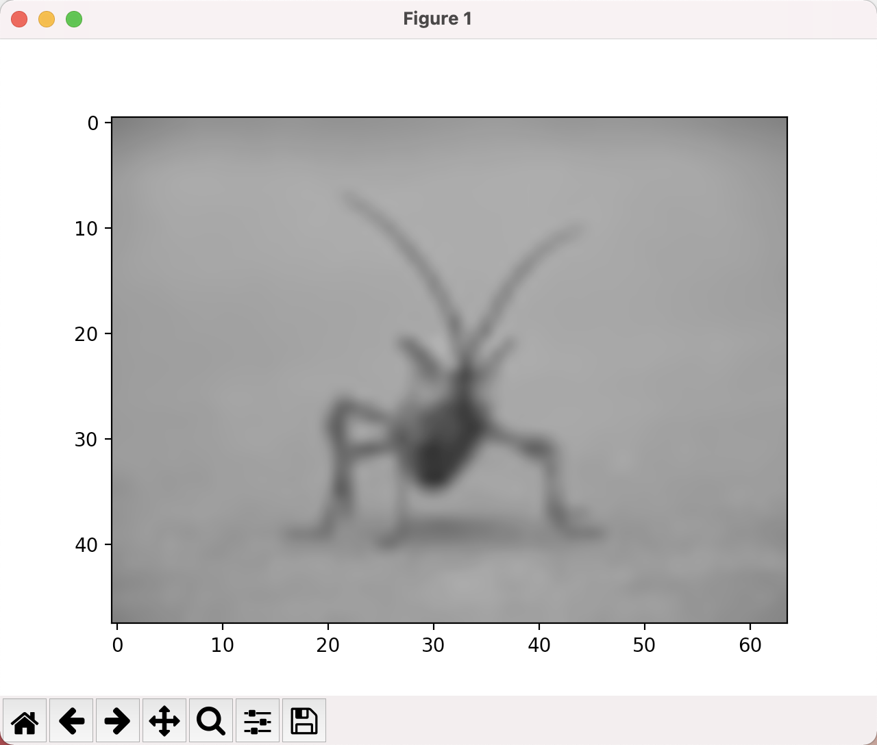
数组插值
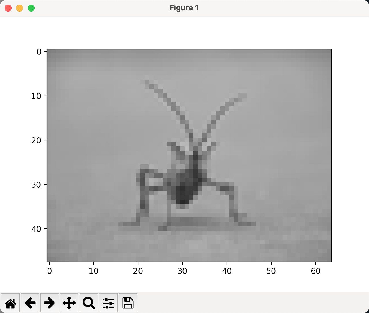
from PIL import Image

img = Image.open("stinkbug.png")
img.thumbnail((64, 64), Image.ANTIALIAS) # resizes image in-replace
imgplot = plt.imshow(img)

from PIL import Image

img = Image.open("stinkbug.png")
img.thumbnail((64, 64), Image.ANTIALIAS) # resizes image in-replace
imgplot = plt.imshow(img, interpolation = "nearest")
from PIL import Image

img = Image.open("stinkbug.png")
img.thumbnail((64, 64), Image.ANTIALIAS) # resizes image in-replace
imgplot = plt.imshow(img, interpolation = "bicubic")